Client
Stripe
Role
Lead Product Designer
Direct Reports
0
Redesigning Stripe’s Mobile Risk Review Workflow
Simplifying high-stakes fraud decisions in a complex, data-heavy product
Simplifying high-stakes fraud decisions in a complex, data-heavy product
Simplifying high-stakes fraud decisions in a complex, data-heavy product
▷ Overview
Global financial services organisation
Mobile review experience no longer supported fast, high-confidence decisions
Led the redesign of Stripe’s mobile risk review workflow for flagged payments
▷ Overview
Global financial services organisation
Mobile review experience no longer supported fast, high-confidence decisions
Led the redesign of Stripe’s mobile risk review workflow for flagged payments
▷ My responsibilities
Owned the end-to-end product design across workflow, IA, and key mobile screens
Defined decision paths, state models, and interaction patterns for edge cases
▷ My responsibilities
Owned the end-to-end product design across workflow, IA, and key mobile screens
Defined decision paths, state models, and interaction patterns for edge cases
▷ Team
Me (Lead PD), tech lead, 3 engineers
Also included cross-functional stakeholders across policy, support, and platform and data science and risk operations partners
▷ Team
Me (Lead PD), tech lead, 3 engineers
Also included cross-functional stakeholders across policy, support, and platform and data science and risk operations partners
▷ Outcome
Reduced median review time by 32%
Increased first-pass resolution by 21%
Improved decision consistency across reviewers by 18%
▷ Outcome
Reduced median review time by 32%
Increased first-pass resolution by 21%
Improved decision consistency across reviewers by 18%

▷ The Challenges
As Stripe’s fraud operations grew in volume and complexity, the mobile review experience became harder to use in the moments that mattered most. Reviewers were expected to make fast, high-confidence decisions while working across fragmented signals, overlapping system states, and limited screen space. Critical context — like transaction history, account behavior, risk signals, and prior actions — was available, but not organized in a way that supported quick judgment. On mobile especially, the workflow often exposed too much raw information without enough structure, making it harder to understand what was happening, what action was appropriate, and what the downstream consequences would be.
The challenge was not just simplifying the interface, but redesigning the workflow so complex decisions could be made more clearly, consistently, and efficiently under pressure.
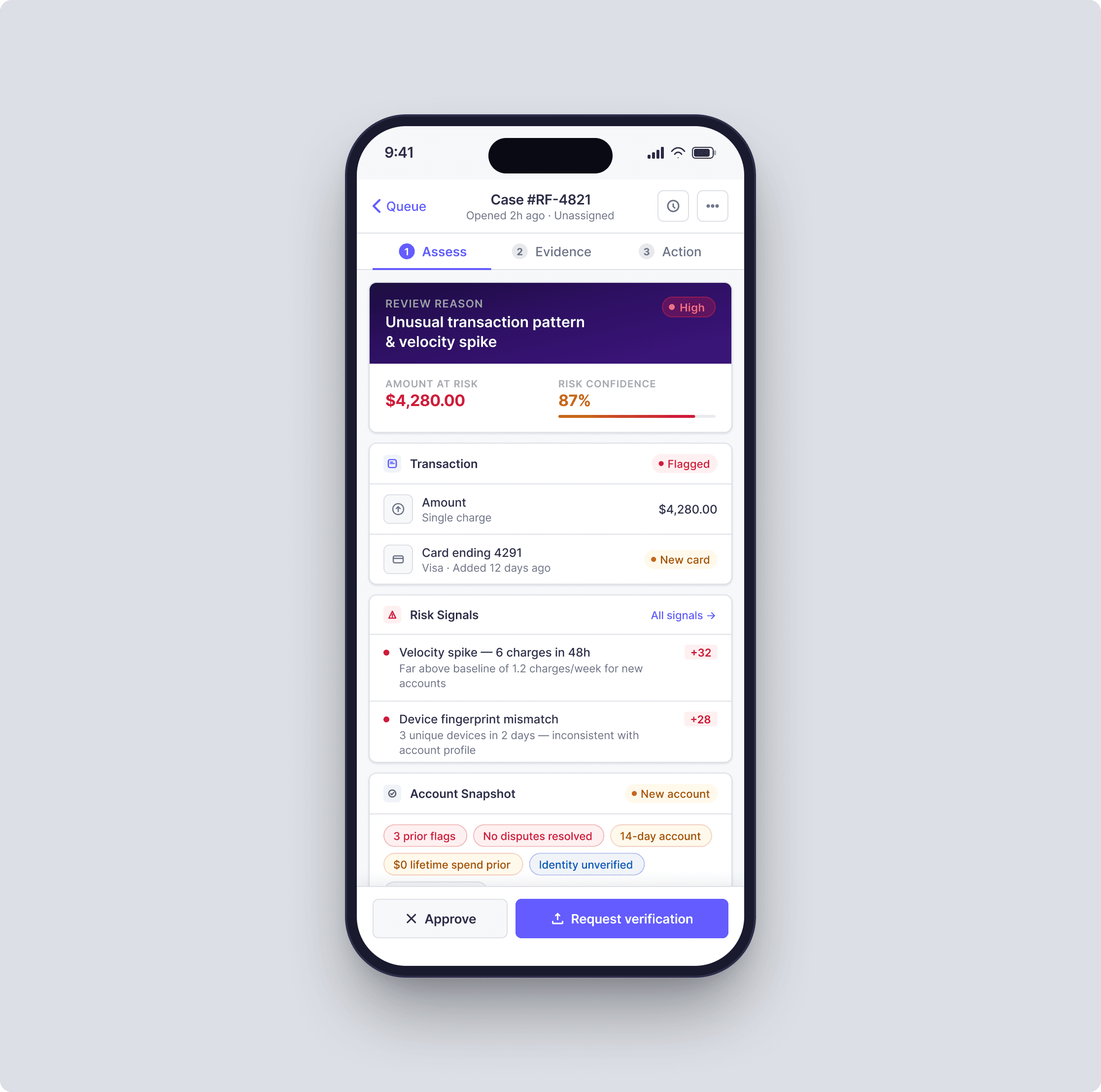
Reframing the workflow around decisions, not records
The legacy experience was organized around transactions as isolated records. In practice, reviewers were not just looking at payments — they were trying to answer a sequence of questions:
What is happening?
How risky is it, really?
Do I have enough evidence to act?
What action is appropriate for this case?
What happens next if I choose this path?
The old UI made users hunt across disconnected surfaces to answer those questions. I redesigned the flow around a clear decision model:
queue → case assessment → evidence review → action → follow-through
This reorientation sounds subtle, but it changed the product from being a dense collection of data panels into a guided operational system.
(note the designs shown here are not final for confidentiality reasons)
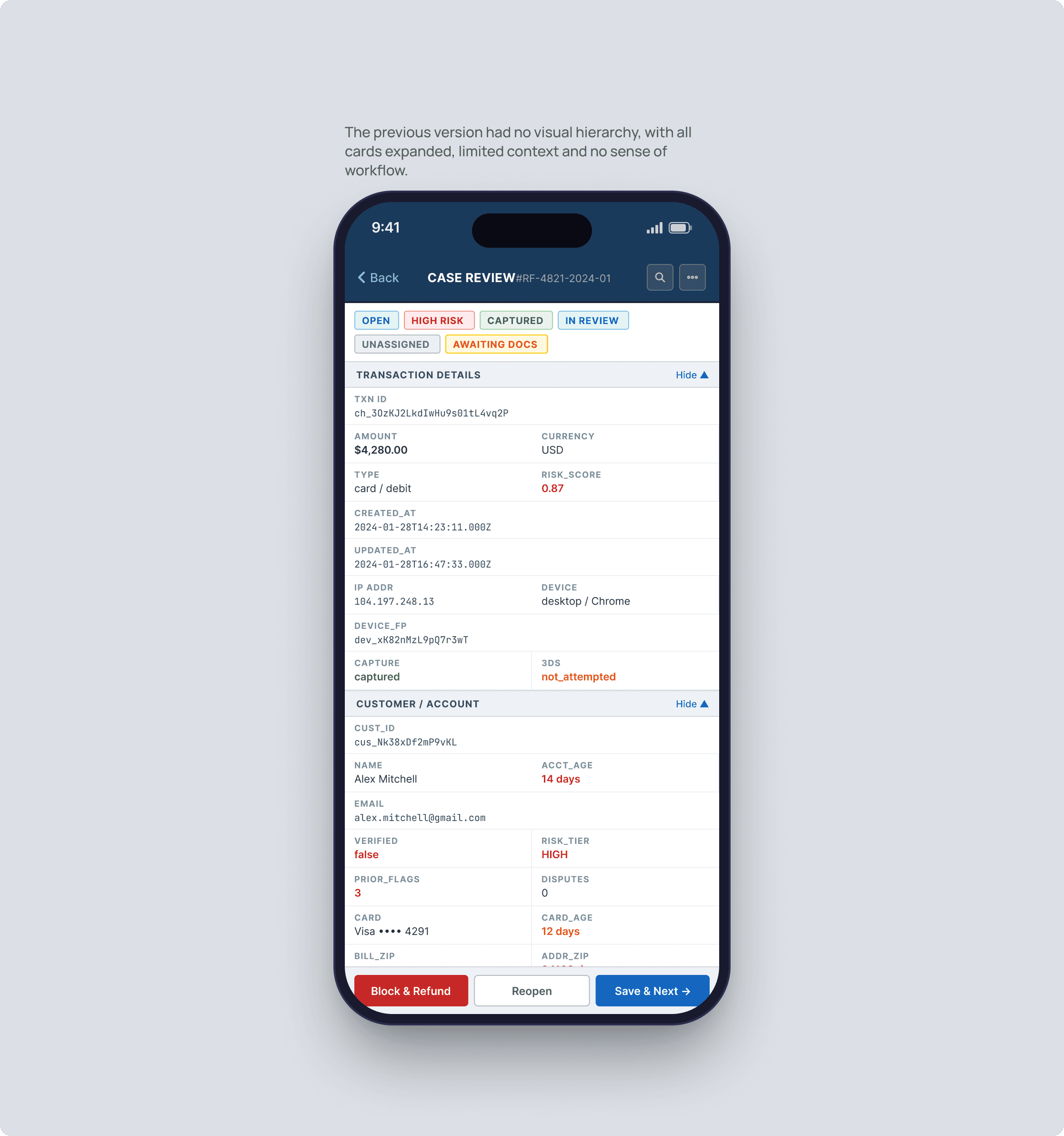
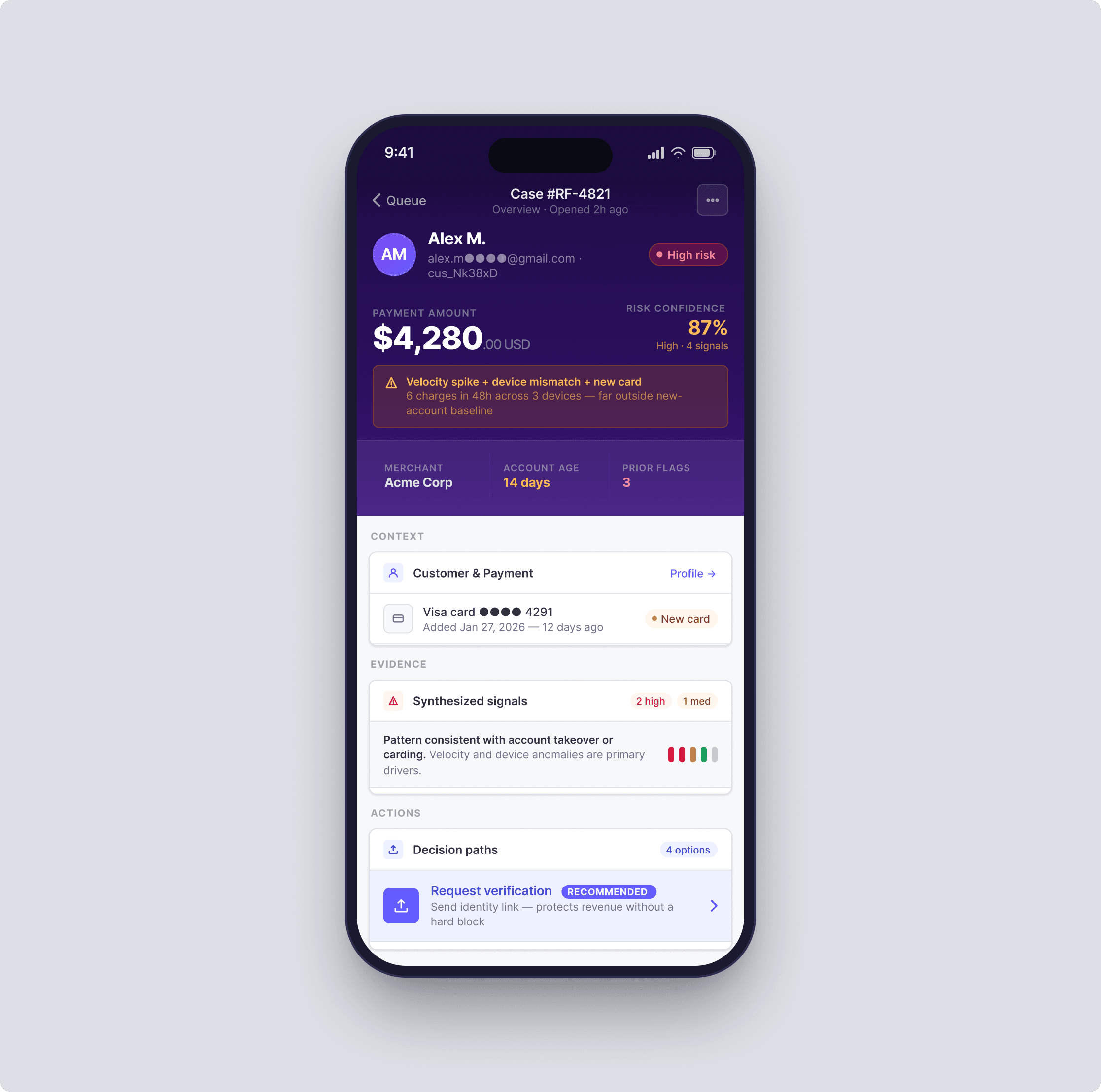
Consolidating fragmented signals into a single case narrative
One of the biggest problems was fragmentation. Reviewers had to piece together context across payment details, customer profile history, risk flags, device signals, merchant behavior, prior disputes, and internal notes. The information existed, but it was not structured for decision-making. I introduced a case summary layer at the top of the workflow that synthesized the most decision-relevant context: -case priority -review reason -risk confidence -amount at risk -account history snapshot -key anomalies -recommended next step Below that, I organized the rest of the page into three clear zones: -context — who/what is involved -evidence — why the case was flagged -actions — what the reviewer can do next This reduced premature deep-diving and helped reviewers orient before scanning raw details.
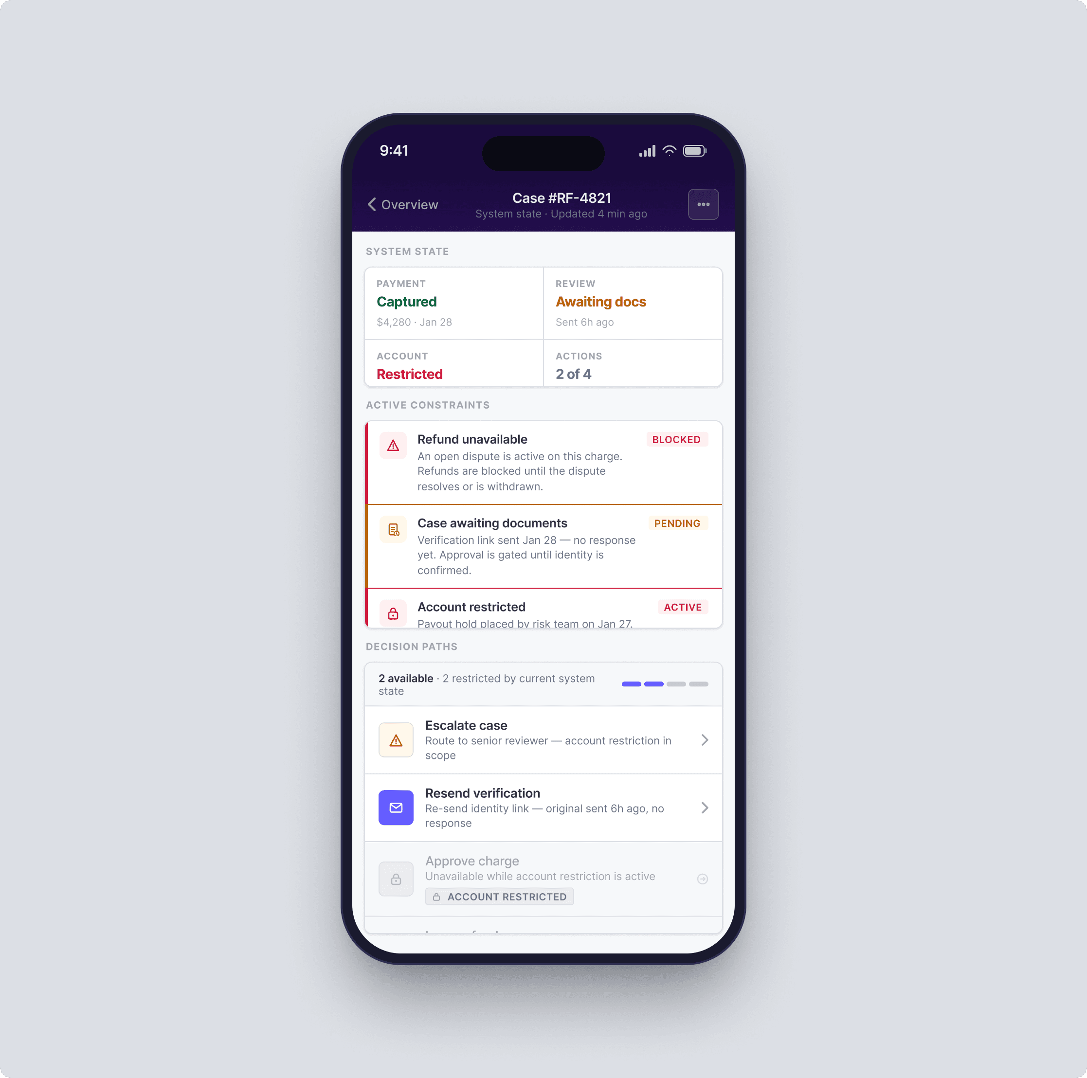
Made state complexity explicit instead of hiding it
A major source of error came from invisible transitions. A payment could be pending, challenged, captured, refunded, partially refunded, blocked, or already escalated. A case could be open, snoozed, assigned, awaiting documents, escalated, or resolved. A merchant account could have separate restrictions that changed what actions were allowed.
Previously, the interface surfaced those states inconsistently, forcing reviewers to infer what was actionable.
I designed a state model that made operational status explicit at every level:
object state — payment, charge, account, dispute, payout
workflow state — unassigned, in review, escalated, waiting, resolved
decision state — enough evidence / ambiguous / blocked from acting
system state — action available, action restricted, action already taken
This mattered because the design challenge was not visual polish; it was preventing contradictory or high-risk actions.
The new design used status grouping, dependency rules, and inline consequences to make the system legible.