Client
LNER Digital Signaling System
Role
Lead Product Designer
Direct Reports
3
Bringing clarity to the highly complex rail sector
I led the design of the UK’s first seat capacity app
I led the design of the UK’s first seat capacity app
I led the design of the UK’s first seat capacity app
Visit Site
▷ Overview
Designed new seat sensor display system to display on trains and at stations
Lead Designer, and led a team of 3 (1 researcher, 2 designers)
Team also involved devs, PMs and client
Created a 3 week sprint process to develop, test and iterate on designs
▷ Overview
Designed new seat sensor display system to display on trains and at stations
Lead Designer, and led a team of 3 (1 researcher, 2 designers)
Team also involved devs, PMs and client
Created a 3 week sprint process to develop, test and iterate on designs
▷ Outcome
First seat sensor display in the in the world.
Articles were published in national media such as on in the Daily Mail
System is available now on LNER wifi hubs in the UK, on trains and in stations
▷ Outcome
First seat sensor display in the in the world.
Articles were published in national media such as on in the Daily Mail
System is available now on LNER wifi hubs in the UK, on trains and in stations

▷ The Challenges
Lots of work was done of this before I started…but it wasn’t very systematic or user and outcome-centric. LNER didn’t know how to move forward, so I had to come up with a new path, and get buy-in from the team.
▷ The Challenges
Lots of work was done of this before I started…but it wasn’t very systematic or user and outcome-centric. LNER didn’t know how to move forward, so I had to come up with a new path, and get buy-in from the team.

▷ The Solution
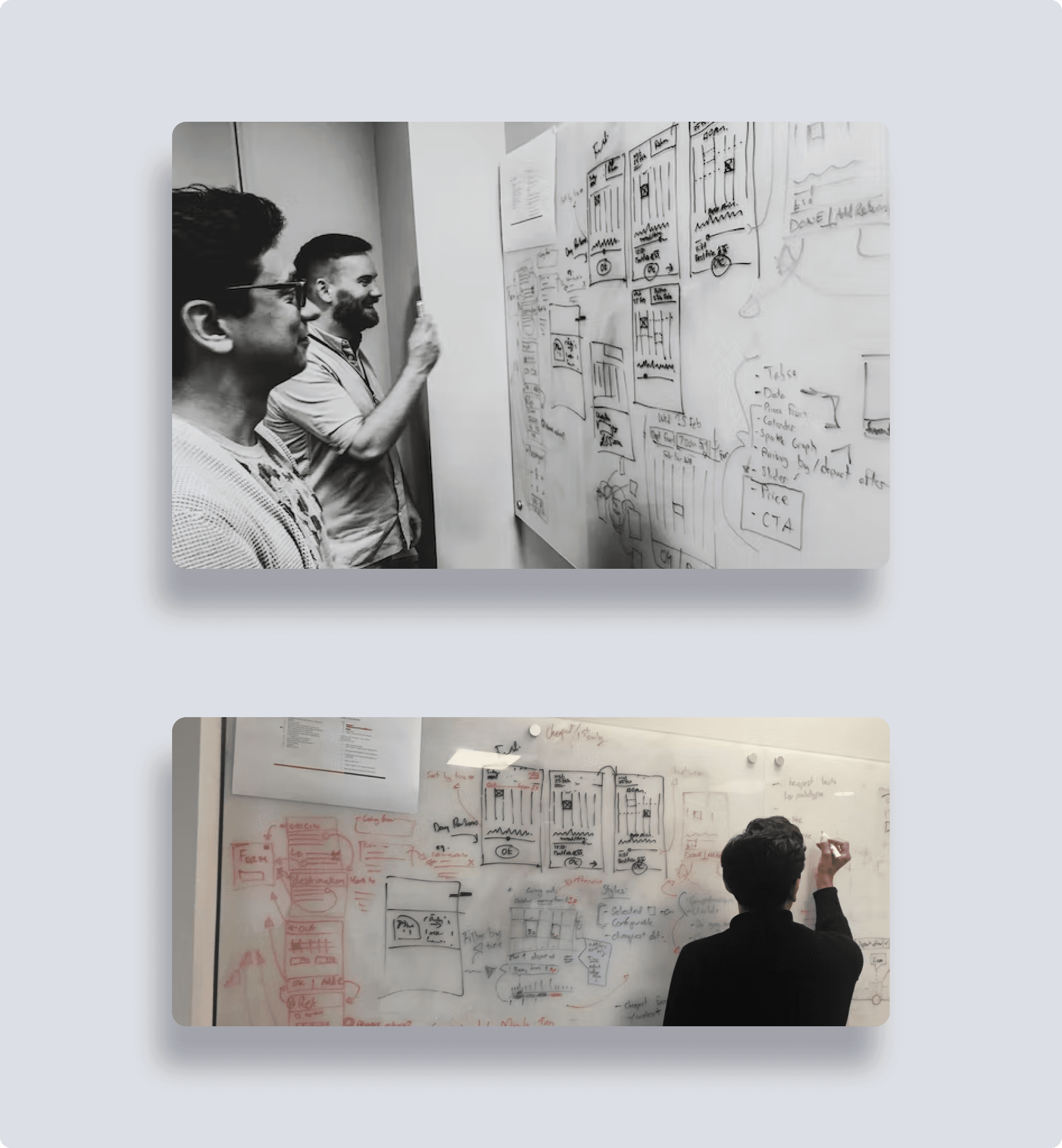
I devised a new 4 sprint process using usertesting.com and low-fi wireframing, and design sprints to get us where we needed to go. To start, and to get consensus and buy-in, I ran multiple workshops with key stakeholders that began with the above challenges. We formed a consensus on the key aspects of the journey that needed improving: namely showing individual seats, showing 'part-time' occupied seats and showing a detailed view of occupancy. I paired participants in groups, provided them with the ‘building blocks’ of wireframes, and let them ideate on improvements. We voted on the most impactful and effective-seeming designs. We then used the low-fi wireframes to conduct user testing via whatusersdo and guerilla testing. My team analysed the findings and found that changing the graphics to look like a train rather than an abstract visual aided comprehension, and showing carriage and seat-level occupancy at once situated the user effectively. We then designed the full UI for the app, web-app, and station screens. This involved scaling individual elements of the designs and removing some to ensure visibility from various distances.
This involved scaling individual elements of the designs and removing some to ensure visibility from various distances.
▷ The Solution
I devised a new 4 sprint process using usertesting.com and low-fi wireframing, and design sprints to get us where we needed to go. To start, and to get consensus and buy-in, I ran multiple workshops with key stakeholders that began with the above challenges. We formed a consensus on the key aspects of the journey that needed improving: namely showing individual seats, showing 'part-time' occupied seats and showing a detailed view of occupancy. I paired participants in groups, provided them with the ‘building blocks’ of wireframes, and let them ideate on improvements. We voted on the most impactful and effective-seeming designs. We then used the low-fi wireframes to conduct user testing via whatusersdo and guerilla testing. My team analysed the findings and found that changing the graphics to look like a train rather than an abstract visual aided comprehension, and showing carriage and seat-level occupancy at once situated the user effectively. We then designed the full UI for the app, web-app, and station screens. This involved scaling individual elements of the designs and removing some to ensure visibility from various distances.
This involved scaling individual elements of the designs and removing some to ensure visibility from various distances.
▷ The Outcome
The system made a pretty big splash - given it was the first in the world. Several articles were published such as on in the Daily Mail The system is available now on LNER wifi hubs in the UK, on trains and in stations
▷ The Outcome
The system made a pretty big splash - given it was the first in the world. Several articles were published such as on in the Daily Mail The system is available now on LNER wifi hubs in the UK, on trains and in stations
